Posts

Portfolio

Image
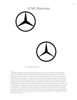
For my portfolio, I wanted something simple but not boring. I liked the idea of making the cover kind of like annotated book pages and then the text for each work like the beginning of a paragraph in a book. I went in order of completion of the projects to display the growth of my skills over time in this course. Starting with the HTML illustration and ending with the rotoscope. Choosing the fonts, I wanted something simplistic and sophisticated so the statements would be easy to read. For finishing touches, I added drawn stars to the corners of the covers as well as a line underneath my name like ones that are seen under signatures.

Rotoscope

Image
  At the beginning of creating the rotoscope, I was stuck on what scene to do. When I finally set my mind, I decided to use the final scenes from Knives Out directed by Rian Johnson. I did cut the final scene shorter to only 5 seconds to ensure I wasn’t tracing for hours on end. I began by changing the frame rate to 12 FPS to make it easier to outline each scene. Going frame by frame I outlined almost every detail, including clothing, props, and even writing on the props. Though I did not trace the faces, I thought that tracing other details would make the finished product still complete. One of the most challenging projects, creating this took a lot of attention. I did use the Wacom drawing tablet to make the tracing easier, in which by using the tablet it cut down the time it took to create the finished product. In the end, I looked back on each frame to make sure each detail I wanted to capture was in the final product.

Lyrical Poster

Image
  For this project, I was inspired by the song I Know The End by Phoebe Bridgers. With the amount of imagery within the lyrics, I thought it would be a great song to create visually. My base began with the image of a blank billboard. Before adding the various elements, I edited the saturation and contrast– making the sky and other parts duller and letting the blank billboard stand out. For the various elements within the project, I used images described in the song lyrics. I added bolts of lightning facing both directions, crows flying to add to the ominous message on the billboard, and a ufo that is mentioned as a “government drone or alien spaceship”. The text components within the project have the most detail. As the giant message across the billboard is quite dark, I added splatter and spray paint details to add to the overall dark mood. The picket fence was the final addition to the board to complete the billboard’s design. In the end, I decided on adding lyrical text on the sides

Self Insertion

Image
 I started off this assignment with a photo of my friend. Considering the background of the original photo, I wanted to go with something very earthy and "woodland creature"-like. After cutting the original photo of my friend out I placed it behind a root of the tree to look like she was peaking out from behind the root. I used the eraser tool to erase along the sides of the root so the image did not overlap. For the shadow and light, I used a mix between the burn and the dodge tool to darken the parts where it would be shadowy and lighten the parts where the sunlight would hit like how it hits on the tree.

Complex Illustration

Image
  Artist Statement: I started by using the reference photo as an outline and lowering the opacity to be able to see my own paths. Using the pen tool, I outlined all sections of the UFO, even parts that were just shadows, to separate everything as it looks. I used the gradient tool on all aspects of the UFO including the windows, editing the angle and shades as it looked in the reference photo. I eliminated the stroke for every path so it became a clean look. I used only the pen tool for simple shapes like the bolts of the UFO that line the bottom rim. For the background, I shaped a rectangle to the artboard size and then used the gradient tool again to give the background depth instead of it being a flat color. The shooting stars and other stars were made using the pen tool to give each star a unique character. Specifically, the shooting stars have two paths overlapping each other to give the illusion of a shadow or dimming ends.

Exquisite Corpse

Image
  Artist Statement: Going off of the original photo, I wanted to keep the illustration relatively close to the original drawing. Using the pen tool for the head and body of the cat, I made a simple outline for the final illustration. I did go off with my creative liberties with the pants, shirt, and shoes. I went with an "Earth Day" T-shirt and cargo pants along with high-top sneakers to go with the cat's chill pose. On the face, I also added eyebrows to make it less creepy. I copy and pasted many elements to create symmetry like the eyes and eyebrows but kept things like the ears and arms different to not make the illustration too "cold". For the background, I wanted to create depth, in so I used the pen tool to create dirt as well as distant mountains to make it look like the cat was standing far away almost like on top of another hill. To add more to the sky, I created clouds and used the gradient tool to make sure the clouds weren't too one-dimensional.

Caligramme

Image
  Artist Statement     For this project, I wanted to make something inspired by one of my favorite artists, Taylor Swift. I used the pen tool to create an outline of a scarf, a large symbol in one of her most famous songs All Too Well. Using the color red in the font, I made a little nod to the album that the song is in. I also used a Times New Roman font(italicized) as it fit the emotions of the song. For the text, I used the lyrics from her song All Too Well(10 Minute Version) for the outline and the inside of the scarf. For the inside text, I made it a darker shade to emphasize the shape. For final touches, I added the title of the song largely at the top as well as the credits for the songwriting in black to stand out.

Logo Icon

Image
            Final Logo Reference Image Statement:      For my fictional company, I wanted to center the logo around one of my hobbies– collecting records. I wanted to go beyond a typical logo with a record where it either was the logo entirely or part of the name. I felt that a shopping bag was appropriate as the company would be both an in-store and online record shop. I am also a big fan of the color sage green and thought it would go with the company well and provide a simple and identifiable name. I also added the company's name below for the logo to be easily tied to a business. In terms of creating the logo, I started with the front shape of the bag using the rectangle tool to create the basic shape then using the direct selection tool to modify the proportions. After, I made the record using the ellipse tool as well as the curvature tool to create the grooves of the record. I also used the ellipse tool for both the handle of the bag to create a perfect half oval shape and th

HTML Illustration

Image
  (Reference Photo on top and Final Project on the bottom with label) Artist Statement Though the logo is simple, the production process took quite a while. It is not entirely accurate with the thickness of the lines being different but it is relatively close. I started with the basic code for a circle and centered it directly in the middle of the reference graph. After I filled the circle with white to create an open shape for the triangles inside. For the triangle directly straight towards the top of the circle, I placed the bottom line at the center point and only had the other sides less than 2 squares away from the center. For the smaller triangles facing opposite directions, instead of having the bottom side create an almost square with the top triangle, I had them directly connect to the bottom side of the top triangle so there wasn't any open space. I did have to modify the angle of the bottom triangles for them to be higher up as they were fairly low before. For final touc

About Me 🎬

Image
Hi!